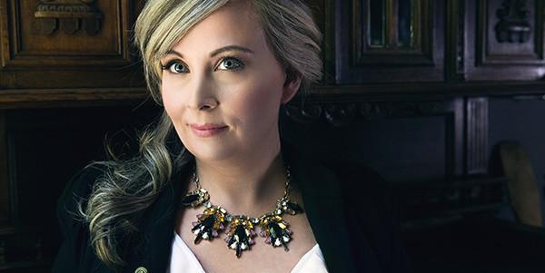

My jewelry style has always been pretty classic. I tend to go for pearls, silver, and a few antique gold pieces. With fashion jewelry, it’s almost always black, grey or silver. Pieces that would look good for a long time and mix and match well. However, since we began preparing for 7 Charming Sisters, I am astonished to be introduced to an abundance of colors. Gorgeous reds, beautiful blues, brilliant oranges, I can go on and on. However, as I continued to work with jewelry this year, I soon came to realize that just saying ‘gorgeous colors’ didn’t do these colors enough justice. For someone who really didn’t pay much attention to colors, I’ve been confronted with not just colors, but shades and shades of colors. There’s no longer just red in my world, but rose, ruby, garnet, carnelian, blood red, brick, etc. You get what I mean! The very first moment that I knew I had a crush involving colors was when we we’re identifying 7 Charming Sisters “colors”. I told the graphic designer that they were purple and turquoise. Trying to nail down the exact shades we wanted introduced me to the wide world of Pantone.
For those of who you are unfamiliar with Pantone, be prepared to be ‘wowed’. The Pantone Company, established in the 50’s, is the king of colors. They have over 2000 identified beautiful colors and are used in every creative medium you can imagine: graphic design, plastic, interior home designs, etc. When you go to the paint shop and are overwhelmed by the most beautiful colors possible and can’t make up your mind, you can blame Pantone. The Pantone Color Chart and Pantone Color Institute are so influential that companies come to them for research and assistance in identifying their products’ colors. To put it simply, they’re in the business of creating colors and presenting them in special swatch systems that allow designers to find precisely the color matches they want.
To further emphasize how influential they are in society, twice a year, in an undisclosed capital city in Europe, Pantone hosts an ultra-secret convention of representatives from around the world who are tasked with the significant challenge of identifying the next Color of the Year from their 2000+ colors —a color that will ultimately decide the trends for the following year. And that color of the year will define everything from fashion to interior design to advertising to even haute couture for the upcoming year.
If you’re thinking, “Really? This all sounds a bit dramatic,” think again. Remember that awesome yet slightly scary movie The Devil Wears Prada? In one scene, Miranda Priestly (the character was heavily based on the infamous Anna Wintour, Editor in Chief of American Vogue) tells her assistant Andy (who’s trying to be distinctly unfashionable because she thinks the world of haute couture is flighty and not serious enough) that the sweater she’s wearing and thinks is blue isn’t blue, but is in fact Cerulean (a dusky, powdery gray-blue). She goes on to say that after Oscar de la Renta created a collection of Cerulean evening gowns, other designers followed suit… and eventually the color trickled down to the high street, where Andy undoubtedly grabbed it out of a clearance bin.
Guess what? Though the put-down was fictional, the rest of the story wasn’t something the screenwriters made up: Cerulean was the Color of the Year for 2000, the Millennium—and almost every designer from every discipline used it. Runways from Paris to Milan to New York featured Cerulean couture. Avant-garde homes featured Cerulean couches, rugs, lamps, and even kitchen cabinets. Luxury cars with silver bodywork on the exterior featured Cerulean suede in their interiors. Michelin-starred restaurants featured accents of Cerulean in their sauces, desserts, and cocktails. Even florists worked the color into their bouquets and arrangements.
That is the power of Pantone! So what does all of this have to do with the Minions?
Well, last April, Pantone announced that for the FIRST time in three years, they were adding a brand new color… and it’s Minion Yellow! Not only is it the first color to be added in 3 years, it is the first color to be inspired by Hollywood. Minion Yellow is bright. It’s bold. It’s happy and uplifting. And it’s a little bit naughty. It says, “Hey, I’m here! Let’s go have some crazy fun!”
Sounds like the 7 Charming Sisters, right? Therefore, to celebrate the frenetic fun and happy and hopeful times to come, we’ve created three necklaces in honor of the adorable Minions and Minion Yellow:
- The first piece is an elegant gold chain with large amber droplets gracing the center. The droplets are offset by round beads in Minion Yellow, which are woven into the necklace with a chord of the same color. It’s stylish and a bit edgy—perfect for a flirtatious evening at a cocktail party! Perhaps, I’ll add some color to my repertoire after all!
- The second necklace is absolutely fabulous. Strands of Minion Yellow beads, offset with Minion Yellow feathers, tumble down from the center of a light gold chain. It’s super sweet when worn with a turtleneck or plunging neckline—so whether you’re at work or out to dinner, you’ll always be the belle of the ball!
- The third piece is nothing short of a showstopper! A chunky gold chain with a pristine white cord woven through the links has large Minion Yellow feathers and smaller gold chains spilling down from it. This statement piece will have all eyes on you when you enter the club… so if you like to be the life of the party (Kimmie, where are you?), this is one piece you have to have in your collection!
With the holiday season upon us, why not put something in Minion Yellow on your wish list? Because even if the Minions stay on Santa’s naughty list, you, of course, can always be nice!
https://en.wikipedia.org/wiki/Pantone
http://time.com/3828041/minions-color-yellow-pantone/
http://entertainthis.usatoday.com/2015/06/28/five-ways-the-minions-proved-world-domination-at-their-hollywood-premiere/